

Statistic it to 'em!
Why the math are we here?

First of all, I want to thank you so much for being here. Because if you’re here, you’re interested in using art to create positive change, and that should be commended. There is power in statistical narratives. On platforms where users tend to spend just a few seconds on each piece content, conveying complicated information in a clear way is crucial. For social justice movements, sharing supporting research can inspire policy changes and prompt action. That’s where data visualization comes in.
Who does she think she is?
I’m a Chilean-American graphic designer, illustrator, data visualist, and educator whose work focuses on social justice and representation. My design company, Leclerc, advocates that agencies create work that is reflective of the communities they serve. This means designing for an audience that is diverse in identity, gender, race, ethnicity, and ability.
Social equity, inclusion, and activism are major aspects of my work. I have developed design and data visualization for activist and advocacy organizations like Campaign Zero, Be a Hero, and Ojalá Productions. In 2017, I created the data visualization for Elizabeth Warren’s book, This Fight is Our Fight. In 2019, on behalf of Campaign Zero, I led the data visualization for the first police scorecard in the US, which sought to identify urgent issues surrounding police accountability and propose best-practice solutions.
In 2022, My work was recognized by Latinas in Tech in partnership with Korbel California Champagne, which named me one of 30 Luminarias in the STEM fields.


What is data viz?
Data Visualization is a translation of data into visual form is that easy for the viewer to understand. Examples may include things like pie charts, bar graphs, or line charts. According to research complied by 3M, we can process visuals 60,000 times faster than text. They go on to say the average person only remembers about 1/5 of what they hear.
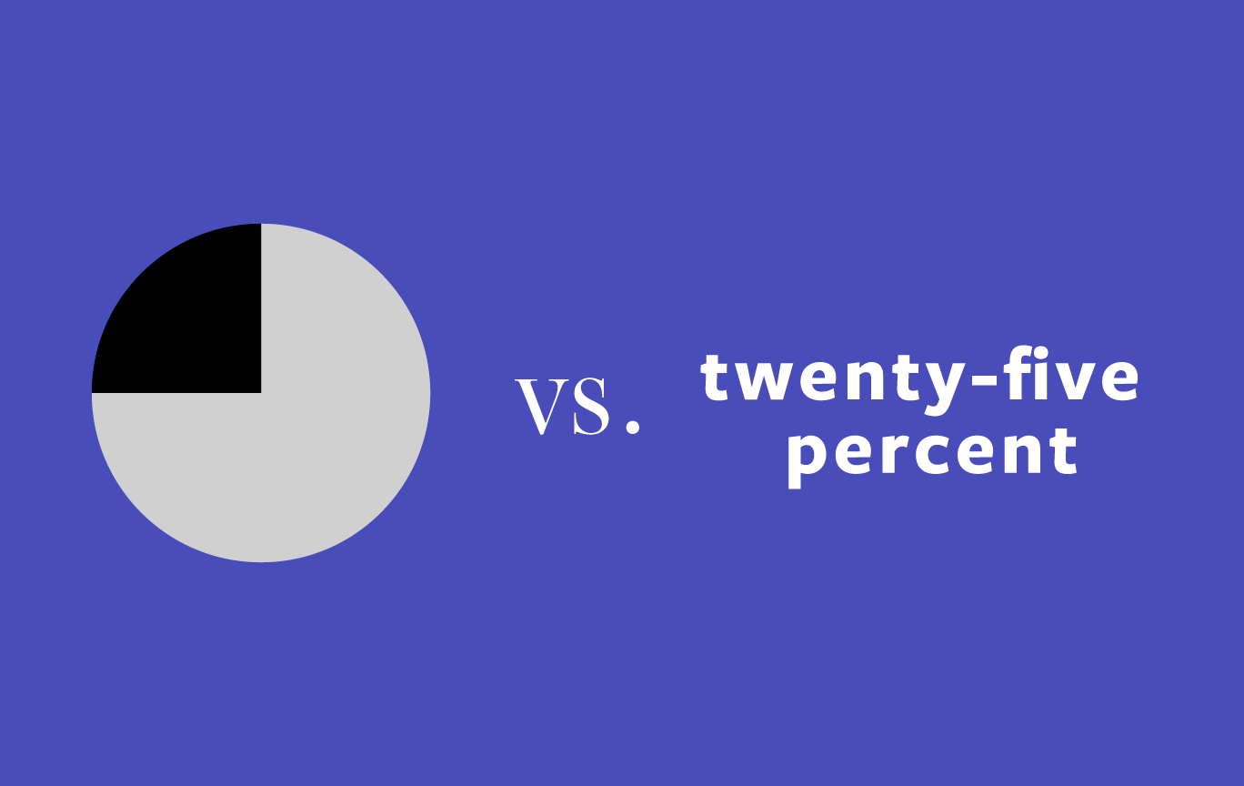
So look at this image: look left then look right.
Which one takes you longer to process? If you’re sounding out the word twenty-five percent in your head, you’ve already processed it slower. And it’s no wonder: there are 18 characters, and you are recognizing each one. In the pie chart, you’re only processing the image. This is why when you need to convey complicated information on platforms and you have only seconds of the viewer’s attention, data visualization is ideal.
So when you see a compelling data set, don’t hold back. Pop that sucker into a graph and share it with the world. Statistic it to ‘em.