

Rainbow in the Chart
Best practices for pie charts


Once a week, when the weather is nice, out comes the Holy Diver tee. It’s not suitable for children. I know that because my daughter was pretty alarmed when she saw the illustration: A malevolent devil (his name is Murray) hovering over a priest surrounded by water. She was concerned that the soggy padre was in for it. I looked at it with her for a second and asked, “How do you know the demon isn’t saving him?”
Who is really drowning here? It’s us. When we listen to Dio, we are drowning in a flood of perfect metaphors, and I can prove it. I searched all of Dio’s lyrics for the phrase “just a” to see what followed:
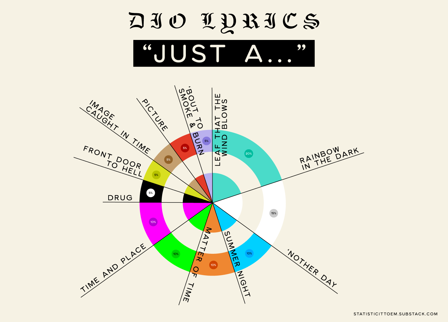
Delightfully, “Rainbow in the Dark” is our winner. This is where my daughter would point out that rainbows can’t exist without the presence of light. I hadn’t thought about that, but then again, metal obeys its own laws.
Speaking of laws...
When making pie charts, keep these best practices in mind:
All percentages added together should equal 100%. Some folks add a slice labeled “other” to fill in that space.
Your slices should be organized by largest to smallest or smallest to largest to ground the viewer.
Do not distort the chart by making it 3D or putting it in an odd shape. This can be misleading to the viewer and we want to show our data as faithfully as possible.
Label all of your slices and include the numbers.
Pie charts are usually the best medium if your information is in percentages. You can typically make most data sets into a percentage, so if the mood to pie-chart strikes you, as the late Ronnie James Dio might say: “Jump, jump, jump on the tiger!”